
Web Design & Development
Responsive Development
Interfaces that stay clear on a phone, a laptop, and the screens in between.
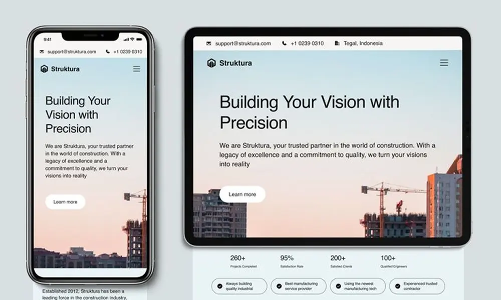
We develop responsive layouts as part of the site, not as a shrink of the desktop design. Type, images, navigation, and forms are built for the screen someone is actually using.
A page that only works on a large monitor fails the people who arrive on a phone. We design and build both, and check them together.
What's included
- Mobile, tablet, and desktop layouts
- Touch-friendly navigation and forms
- Images sized for the screen
- Consistent type and spacing
- Checks across common devices
Tell us about the site you want to build.
Let’s build something useful